
c/splatoon Banner Proposal
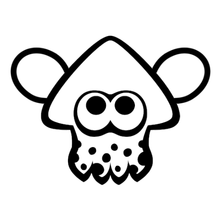
I finally had time to draft a banner for c/splatoon. The inklings talking through paper cups is the representation of federation.
Feedback welcomed! For modifications, I won’t be posting every time I make some changes. Instead, you can watch them on GitHub Gist:
https://gist.github.com/North-West-Wind/68b55eb70d00de49b7ebde92af258b49
@splatoon #splatoon #splatoon3 #splatoonart #splatoonfanart #fanart #vectorart #art #nintendoswitch #banner
Oh, I love the idea/aesthetic! Very cute and bright haha! Appreciate the effort ya put into it!
I wanna suggest some changes I think might be nice to incorporate before adding it right away, but will try and put some work into it and send them in a bit.
Either way, cool stuff! :D
@carp4lemmy please do suggest!
Sorry if this is a little bit too much, just figured it’d be nice to have a little more for ya since I was already making suggestions, but I think the banner’s lovely in its own right, too!

Some explanation(s):
- All the hashing is just some subtle shading, pretty much
- All the red is some edits going top-down, left to right:
- Make the clouds more definitive and in 3’s to make them seem a little more natural
- With some mild shading that follows the “height” subtly of the top of the cloud
- Make the c/splatoon part more wavy in the water and leaning only slightly towards “splatoon”, in the air
- Or just putting it all in the air after moving the characters a little, too, potentially
- Make the boat in the background a little more transparent and maybe move it around some after editing the text
- Push the shoreline downward so it takes up a little less real estate and looks flatter to appear more like it continues outside of the frame
- Also makes the eye more drawn towards the art and adds some flow to the pic too
- Move the left character to the right to fit a little more text; and potentially move the island right, too, so that it feels like it’s cut off to the right
- Squeezing the left character’s arm in a little since it seems a little too oval-y, to me
- And maybe changing the receiving end to a squid/octopus so it feels a little more blobby/shapey and pointed (and fun way to show a mechanic? haha)
- Make the clouds more definitive and in 3’s to make them seem a little more natural
Either way, I think it’s super cool what you’ve done so far and I’m mighty looking forward to what you can do in the future, too! :D
Edit: forgot to mention also making the waves come out from the shore lines a little more (in sets of odd numbers for that made-in-nature aesthetic!), with some foam/reflective, white coloring to them, too, potentially. 👍
@carp4lemmy thanks for the feedback! How’s this then?
Edit: Mastodon image didn’t quite work on Lemmy. image
I was thinking more hard cut-offs for the shading and less gradients, but I don’t wanna ask too much more cause I think it’s nice, regardless! Will put it up now, and awesome stuff!! ^^
P.s. Thanks again for making such a fun banner for the community and happy to have ya here! 😄
Friggen cute, I love it! The cups with string for communication are such a clever idea
@NorthWestWind @[email protected] forgot to take a look at it, it’s great!
