
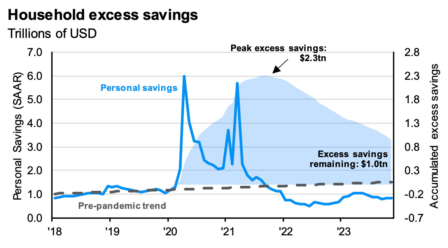
JP Morgan data, via Daily Chartbook.
You must log in or register to comment.
No, I’m not sure what “excess savings” means, exactly, it implies a “normal savings”, and the chart provides no definition. You could Investopedia the answer but there’s no guarantee that J.P. Morgan is using the same formula. Trying to chase the data back to J.P. Morgan is going to be fruitless, since you just hit J.P. Morgan’s soft paywall.
I provide this data because it’s kinda the best that average folk can get, with the endless catch that all you get is this chart floating around like a meme.
What seems to be true is that Americans are still sitting on a solid pile of cash. To the best of my knowledge, these numbers are US numbers.
What’s also true, as shown in some of last year’s charts that I’ve seen, is that the bottom quartile of earners - the actual po’ folk making less than 40k a year - have exhausted their “excess savings” from the pandemic stimulus. That exhaustion happened a while ago.
This “excess savings” is likely in the hands of high earners, the middle and upper middle class, who obviously don’t have pressing reasons to spend it. This conclusion was also supported by data I’ve seen. I’m not guessing about it.
The number in the posted chart is trending down, though, pretty firmly, which stacks up well against anecdotes from online where people with “good” jobs are still feeling badly squeezed. They ain’t broke, broke, but they keep having to dip into savings they’d rather keep. The poors, then, have been underwater for a while.
So that’s probably why so much online screaming despite most of the economic numbers looking at least okay.
That, and everybody who’s doing at least okay learned not to stick their head up when the wailing is happening. One guy shouts to everyone who will listen that he’s doing bad, bad, bad, but heaven help you if you come back saying you’re doing okay, actually.
This is why anecdata sucks so bad. The actual data shows that consumers are at least hanging in there, and that at least the ones with money are willing to spend it, so the whole merry-go-round keeps spinning.
Core CPI from Trading Economics is trending down, hard. If that 2.5% is the proper inflation rate today, then The Fed is quite pleased and the interest rate should probably be dropping soon.
Other numbers from that source show inflation at 3% but trending flat, neither up nor down, in the US, excluding other nations. Gotta love having at least ten things calling themselves the inflation rate every time you try to get a solid number for that.
However, I’m finding other charts I don’t understand that muddy the water. That’s been the story for the last year. The numbers all seem to be moving in the right direction, but it’s never definitive enough, and it doesn’t matter because the anecdata is all about suffering, suffering, suffering, the rent is too damn high, etc, so there is zero agreement on the truth.
But according to the data, everyone isn’t nearly as broke as they say they are online. That’s been the trend for the last year’s data, as well.
If the trends in the posted chart are truth, then the real shit hits the fan at the end of 2024 when even the rich kids run out of extra money.
I think the truth is that while inflation is well-controlled and The Fed did a good job with it, we’re just back to where we were in 2019, where the rent was still way too damn high and wages had stagnated for decades. That would explain plenty.
Also, here’s another counterpoint:
Oh well. Happy new year.