I don’t have any fancy graphs to show the community’s growth, but I thought it was worth noting this milestone. The largest individual community on lemmy.ca and the largest national community on lemmy as a whole that I can see. Discuss.
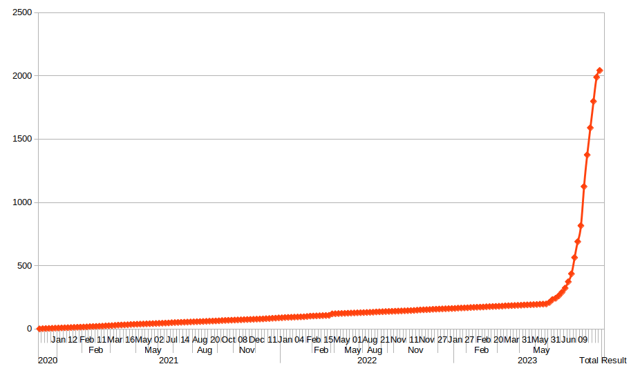
[Edit] A Graph

Credit to our gracious host, @[email protected]


this took me way too long to do, for what it is.
Very Canadian… it’s a hockey stick graph!
Clearly Lemmy and a lack of pirates cause global warming.
Looks like the angle of the slope is flattening out, now that the initial surge is past. What’re the odds you can easily reframe this as “new accounts per day” rather than total users. That would show the Reddit related spike more clearly. (First derivative, if you’re a math person.)
that shouldn’t be too difficult I don’t think. I’ll see what I can do.
Also, the graph somehow reminds me of the first wave covid cases, when we were all obsessed with watching the thing go exponential. Weird, haha.
Well I think it looks pretty good.