I made a post about the shader I’m using on the Steam Deck with an album of screenshots hosted outside of Lemmy upload (on Lensdump) and seems to be better, I think Lemmy is doing something to the image with compression.
Yeah, it looks a bit different on my Steam deck and TV, maybe because they’re OLED displays. It doesn’t come across as dramatic as it is in person on the screenshot. In person there’s more bloom and higher contrast, the characters look more… planted in the world, I guess is the best way to explain it.
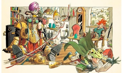
Like, if you look at the rounded parts of the big robot there’s a bit more depth and contrast that give it more rounding and image depth in shadows, but again, the screenshot isn’t doing the effect justice.
Also, the still image doesn’t help because the shader also impacts how the game looks in motion.
I took the screenshots on my Steam Deck, but hadn’t actually seen them until I uploaded here.
At this point it’s one of those things that comes down to taste rather than authenticity. Pixel-art games have continued on and had their own development arc between indie gaming and the remastering trend, and they’ve all had different approaches to it. Even people like me that grew up with CRT displays have had their tastes shaped by years of gaming on different tech.
I haven’t gotten my hands on a CRT since I left my last one behind 15-ish years ago, but I do get a bit of a nostalgia buzz from the CRT-Royale package on a 4K display. When that’s not available I tend to use one of the scalers because I really don’t like aliasing, and high resolution displays really bring out the blockiness. That sort of thing is sacrilege to some people. Everyone’s a little different.
I grabbed some more comparisons, this time from my tablet using the CRT-Consumer shader. Notice stuff like the bloom from the window and shading around the curtains, the kitchen appliances and plants, general shading around dithered stuff like the tent, and the trees on the world map.
Also these are best viewed on a larger screen, it’s hard to see the difference on a phone.
Most of those look worse in the bottom pictures tbh. A couple of the top ones look a little too bright and washed out, but the bottom ones just look low contrast and dark.
To each their own. The ones with the shader are closer to what it looked like on a CRT (minus some extra bloom and color bleed if using composite or RF).
Edit - I made a post about the shaders I’m using on the Steam Deck with an album of screenshots hosted outside of Lemmy upload (on Lensdump) and seems to be better, I think Lemmy is doing something to the image with compression.


I will say, the longer I look at that, the less confident I am that there is any difference at all, lol.
I made a post about the shader I’m using on the Steam Deck with an album of screenshots hosted outside of Lemmy upload (on Lensdump) and seems to be better, I think Lemmy is doing something to the image with compression.
https://lemmy.world/post/26996470
If you only care about the comparison shots:
https://lensdump.com/i/ojBPkZ
https://lensdump.com/i/ojBfHP
Yeah, it looks a bit different on my Steam deck and TV, maybe because they’re OLED displays. It doesn’t come across as dramatic as it is in person on the screenshot. In person there’s more bloom and higher contrast, the characters look more… planted in the world, I guess is the best way to explain it.
Like, if you look at the rounded parts of the big robot there’s a bit more depth and contrast that give it more rounding and image depth in shadows, but again, the screenshot isn’t doing the effect justice.
Also, the still image doesn’t help because the shader also impacts how the game looks in motion.
I took the screenshots on my Steam Deck, but hadn’t actually seen them until I uploaded here.
At this point it’s one of those things that comes down to taste rather than authenticity. Pixel-art games have continued on and had their own development arc between indie gaming and the remastering trend, and they’ve all had different approaches to it. Even people like me that grew up with CRT displays have had their tastes shaped by years of gaming on different tech.
I haven’t gotten my hands on a CRT since I left my last one behind 15-ish years ago, but I do get a bit of a nostalgia buzz from the CRT-Royale package on a 4K display. When that’s not available I tend to use one of the scalers because I really don’t like aliasing, and high resolution displays really bring out the blockiness. That sort of thing is sacrilege to some people. Everyone’s a little different.
I grabbed some more comparisons, this time from my tablet using the CRT-Consumer shader. Notice stuff like the bloom from the window and shading around the curtains, the kitchen appliances and plants, general shading around dithered stuff like the tent, and the trees on the world map.
Also these are best viewed on a larger screen, it’s hard to see the difference on a phone.
Most of those look worse in the bottom pictures tbh. A couple of the top ones look a little too bright and washed out, but the bottom ones just look low contrast and dark.
To each their own. The ones with the shader are closer to what it looked like on a CRT (minus some extra bloom and color bleed if using composite or RF).
Edit - I made a post about the shaders I’m using on the Steam Deck with an album of screenshots hosted outside of Lemmy upload (on Lensdump) and seems to be better, I think Lemmy is doing something to the image with compression.
https://lemmy.world/post/26996470
If you only care about the comparison shots:
https://lensdump.com/i/ojBPkZ
https://lensdump.com/i/ojBfHP