
The new version of the image generation is so incredibly garbage it’s genuinely unusable. Instances of AI artifacting have multiplied exponentially, the system barely follows prompts, characters are jumbled messes of blurry features, it’s awful. If it’s an issue of expense, I would be willing to donate along with countless others if you took a collection. Please as a community we beg of you to change it back. I would be happy to pay for access to the better model, or a subscription for improved functionality, just anything but this.
Question, why not utilize some of the few FOSS generators, where you pick the model and you know it won’t change on you? Once you found something which works for you ,you can keep using it forever.
I wasn’t aware of them. Could you link a few? I’d love to try them out.
Haha countless others.
I don’t think it’s bad. I think the AI’s results vary based on prompts. If you’re extra detailed in your prompts then you will get good results. Otherwise, if you aren’t too hyper specific, then you’re going to get a bunch of junk images. The whole point of the AI image generator is to write good prompts.
Basically, good prompts = good results, bad prompts = bad results.
You don’t have to write an entire paragraph. All you need to do is write what you want the AI to generate, preferably either in a list format like this:
Caucasian female, brown hair, green eyes, wearing a blue dress, sitting on a bench at a park, holding a parasol
Or as a character description, like this:
A Caucasian female with brown hair and green eyes wearing a blue dress sitting on a bench at a park and holding a parasol
Of course, results vary as the AI’s outputs tend to be randomized, but as long as you write good prompts, you won’t get bad images. Hope this helped.
Klein: the current model is alao a super distillation model, that’s relatively new under the hood it is a highly technical model at that, and so lota solutions experimenting, and developmental research is needed. Although if you are really good at summary prompting and happy with its more pre deterministic blends of base style locks Its distillation makes those powerful and they pick up on crappy prompting even and make good of it. I’d just keep in mind the new model is still in it’s early days, somewhat still being trained, and even its developmental teams are still studying the potential and upper limitations of the model designing varies sub/routines for it. It being a highly technical model also means you may find there’s actually more features to leverage under the new models hood, you just need to know how too either or JSON/Format/or generally prompt your way into those features.
“relatively new under the hood it is a highly technical model at that, and so lota solutions experimenting, and developmental research is needed.”
In other words, they are using the production environment as a test platform. Brilliant.
admittedly even I got frustrated at it earlier today,… Just needed a break from image gen and technical rebuttal in general I guess. Oh yeah LOL “yes I’am back on lemmy world” Goos break It was haha .
so incredibly garbage it’s genuinely unusable
I take it this is that famous “constructive feedback” I keep hearing about? :)
Image generation is fine; revise your prompts. I can help you with it, if you like, long as it’s PG-13 (else sorry but nope).
Or better yet, check the galleries and steal some ideas, that works too. Sometimes there’s rather nice-looking stuff posted on the default gen (this one).
Instances of AI artifacting have multiplied exponentially, the system barely follows prompts, characters are jumbled messes of blurry features, it’s awful.
I go from looking at what other people are making as well as my own experience, for what it’s worth, and I cannot see your statement as anything other than hyperbole, if not outright fiction. Sorry.
I would be happy to pay for access to the better model, or a subscription for improved functionality, just anything but this.
Facepalms echo across the galaxy!
Even if we ignored the implicit question – would you even still be here – you’d nevertheless shoot yourself in the foot with this one. What we have now is better AND we have access to it for free, yet people ask for a subscription on top of a downgrade! How about NOOOOOOOOOOOOOOO???
Look, I don’t know. I get the feeling that you have not put the slightest effort in trying to learn how to prompt effectively, because if you had, we wouldn’t be having this discussion. Or put more succinctly:

Meant only as a friendly poke, lets not get ahead of ourselves.
Anyway, assuming I haven’t yet antagonized every fiber of your being, my offer is honest, so you tell me if you need help.
OK byeeee :D
I’m really sorry, but the generator is degraded. Images tends towards the cartoonish, anime or manga, really junky imaging that can done on any run-of-the-mill AI generator. Used to be before, you could make wonderful artistic images in an academic, Art Deco, vintage, beaux-Arts, representational art style, like Norman Rockwell covers or pulp fiction covers. Now it is virtually impossible to get that done. The default always pushes back towards cartoonish, childish stuff, big heads, large eyes, narrow waists on people.
This is so sad. Especially with all the months and months of work put into experimenting with and trying out prompts. Now you can get a good working prompt and two days later it produces lousy images. Can’t be counted to work again. And all the work, time and effort put into making hundreds of good working prompts is all down the drain. And I surmise that when** yet another upgrade** is introduced, any prompts that work well now, will also end up being useless. Constant unasked for change ruins good things.
Yes, I too would be willing to pay IF the older model were reintroduced, the model prior to Jan 2026.
Yes too much cartoonish images and a white blank background.
I’m really sorry
I know you are :)
Images tends towards the cartoonish, anime or manga, really junky imaging that can done on any run-of-the-mill AI generator.
The literal hundreds, if not thousands, of photos and paintings being generated every day would beg to differ. You can see the galleries if you don’t believe me, eh.
Used to be before, you could make wonderful artistic images in an academic, Art Deco, vintage, beaux-Arts, representational art style, like Norman Rockwell covers or pulp fiction covers.
I pasted this exact quote here as a jest and what it gave me was close enough, so this is clearly moreso a matter of “minimal effort required” than “virtually impossible”.
The default always pushes back towards cartoonish, childish stuff, big heads, large eyes, narrow waists on people.
Skill issue.
This is so sad (…)
Dramatic!
Adjusting the bulk of my prompts took me two, three days tops. Meanwhile, you’re still here going on about how your old stuff no longer works. It’s already been two months.
Just what are you even doing?
Yes, I too would be willing to pay
OK go throw money at something ^^
When you get totally different results with the same prompt a day or two later, it is NOT a skill issue. It is an issue with consistency and never ending changes and updates. Enough people have commented on how results always tend towards cartoonish looking images, no matter what the prompt. The generator was magnificent from Aug 2025 to jan 2026. Then the update which was a downgrade and it is like wading through molasses to get anything like the previous results. If you want cartoonish, anime, manga or simplistic results, the new version probably doesn’t make much difference. But serious artistic imaging, realistic, academic, beaux arts, art deco, bauhaus, representational art is now out of the picture. A real shame.
On this note I just have to state: Its free image generation, also when you said donate??? You do realize mass community image generation services are likely well over your monthly income to keep running??
it is NOT a skill issue
So you say! :)
never ending changes and updates
There was one update two months ago, and that’s “never ending” changes apparently.
Come on, you don’t even have a point here.
Enough people have commented on how results always tend towards cartoonish looking images, no matter what the prompt.
Given how OP was literally trying to generate cartoons and then complaining about the result being a cartoon – flawless logic – I don’t think that comments give us much to work with here.
I had some instances of actually unsolicited cartoon generation back in January; the issue is already gone for me. I think this was one of the things Dev addressed with one of the earlier fixes, though I’m not entirely sure.
But serious artistic imaging, realistic, academic, beaux arts, art deco, bauhaus, representational art is now out of the picture. A real shame.
Yes, yes, you continue repeating this line over and over; we get it, you’re a pretentious slop-maker, no need to keep reminding us.
But most of what I generate is artistic imaging, generally paintings and photographs, and what I am getting now is much higher quality than before January. So what are you going on about?
This is not your word against mine, this is your word against the pictures everybody else is posting. On that topic:
Could you point me to the galleries? I cannot find a link.
Generate a few images if you haven’t, then scroll to the bottom of the page, and click on the big button labeled “💬 show comments & gallery 🖼️”
Just as I cannot find the negative prompt space either. Things keep changing for no discernible reason.
Not quite, because the show gallery button has always been there, and then the anti-description box was removed because for the longest time negative prompts did absolutely nothing.
If all you’re going to do here is find any silly excuse to complain, at the very least have the decency to come up with a valid excuse.
I’ve made some 10s of thousands of non-cartoonish renders since June of 2025, in the traditional art styles that I prefer and that you think of as ‘slop’. That was something no other AI platform could do that I know of. The results were wonderful. No cartoons, no anime, no manga if that was not what you were trying to do. And I wasn’t nor ever will.
Cartoon render platforms are everywhere. In the galleries there isn’t one image that I have found that has appeal (I stopped looking after a minute or two. They are all the same).
The question remains the same: used to be that the platform allowed rendering of images that were quality-wise miles above other platforms and in truly serious historically significant artistic styles. Why downgrade the quality? Perchance was unique in that ability.
I am not alone in this. That should be apparent from other comments.
And as others have written, if it is a question of finance (as so much is) to get that quality back to how it was, I would be willing to pay. Because it was so unique before this latest version.
I’ve made some 10s of thousands of non-cartoonish renders since June of 2025, in the traditional art styles that I prefer and that you think of as ‘slop’.
“slop” is currently used as a catch-all term for AI generated content, so by all means, we are making slop. Own it.
Why downgrade the quality?
Why would you build your entire posture around opposing updates altogether and then ask for a rollback on top of a fee, instead of providing concrete examples and references of how your input is being misinterpreted so that the Dev can maybe try and fix it?
¯\(ツ)/¯
Effort, perhaps. Artsy slop isn’t impossible to achieve, as you claim, you just have to tinker a bit. It is true that some looks are harder to achieve than others, but number one that’s always been the case, and two, truly impossible styles are few and far between. Pulp fiction covers is definitely not one of them.
So if I had to take a guess, I’d say you have the CFG turned all the way up and that’s what’s causing 90% of your problems, yet you’re out here blaming the tool. Take this:
(guidanceScale:::1)And put it somewhere on your prompt. For anything that’s supposed to look like a painting, using values between 1 and 5 will typically give you the more natural-looking results, whereas taking it higher will result in a more polished, artificial and plastic look, reminescent of the evil cartoons that haunt your dreams.
Try it. Play around. Assume your prompt is bad. Report your findings. And ask for help before launching another drama series about your beautiful collection of 10s of thousands of slop images in a serious, academic, representational art avec des croissants style. ( ~_~)
Could you point me to the galleries? I cannot find a link. Just as I cannot find the negative prompt space either. Things keep changing for no discernible reason.
No you didn’t, you didn’t hand them the “default…jk…” Feel free to visit if;shenanigans then;I can typically be found on that one these days! :)
Did the text to image generator add the text in your image or you edited it??
Done entirely with the generator I linked.
I’m using the exact same generator that I’ve always used. I work with AI every day, and I’ve changed my prompting strategies multiple times throughout this change to try to give the engine the benefit of the doubt.
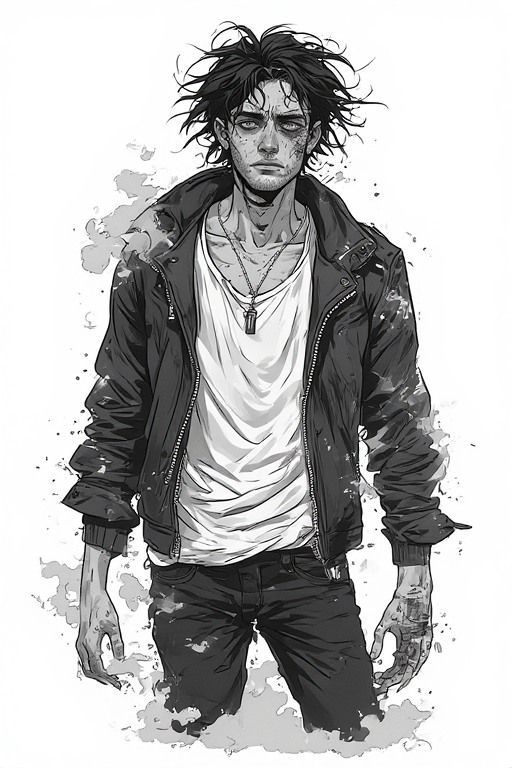
"Digital illustration with a painterly, tumblr webcomic look. It blends anime-influenced character design with Western indie-cartoon expressiveness. Shading is a hybrid of cel and soft airbrush. Planes are defined by clear shadow shapes, then feathered with soft brushes. Unique photo-quality visuals in high definition.
A man with pale skin, black hair, and fangs dressed in a stylish late 2000s outfit consisting of an open leather jacket over a white tank top, silver facial piercings, and black skinny jeans. He is wielding a glaive that emits a smoky, silver aura from its blade. He is standing on a stage, surrounded by a crowd of thousands.
Closeup of the character with visible facial features, composition matches that of late 2010s era tumblr art posts. Serious, non-cartoonish features."
Is my exact prompt. It’s on par with many other prompts I had been using before, now adapted to the new scheme which relies less on negative prompting and () emphasis indication. I pretty distinctly ask for something specific, and define the parameters for that exactly. I state directly that the image should not have exaggerated cartoonish features, and yet I get this fucking slop.


I can’t use any of these images. No combination of prompting principles seems to fix this issue. If you genuinely think that is better than this series I was able to make with the previous generator:


You are genuinely mentally deficient. Your “help” would change nothing.
Edit: One of the site admins also directly posted that the image generator is empirically downgraded for the time being because the text model is taking up financial resources while they debug it. My, and many others’ offer is genuine. If the site needs more money, I’d be happy to provide some for the same quality I’d been getting before as quite frankly, there was nothing else good out there for non-scam prices. This site has a genuine interest in generative media and I’d love to support it. Even if it’s just a donation link. So, kindly shut your fucking mouth.
Double Edit: Inb4 you say some shit about “OH WELL YOU HAVE THE WORD CARTOON IN YOUR PROMPT” western-cartoon indie is an art style. One which doesn’t necessarily have the proportions of cartoon characters, but rather defined by solid colors, hard lines, and complex character design with a few defining traits for each character. Think like Avatar: the Last Airbender. That would be an example of the style. But just to make sure you understand how little that matters, I did another generation omitting that entirely in favor of defining the facets of the style one-by-one. Here was the results:


Still cartoony, warped, barely recognizable slop.
Where is the official admin post please.
Please visit a doctor.
🤨😒🙄😴
I just don’t see what you is getting at… So prompting is a bit harder yes, and stuff like dynamic / Hybridization style blending is a nightmare, but general realism’s? For the most part general realisms are easy if you know a good handful of tricks, or you simply stick to more simpler style mixing aka" don’t mix 2 lenses 2 cameras 2 toon fusions a cartoon and then anime…ect. you’ll be lucky enough to get a single balance split between a stack of similar style details and a chopped up effect possibly with and or swapped with a generic blend like base anime but gutted down, that’s super “distillation for you”‐when only using or leveraging common/natural language and formatting cough😷‐casual prompting
You may have a look at my “non-general realism” If ;just to prove progress being made, then ;yeah it’s possible. I finished getting to this level of quality yesterday,… it still being a “WIP”,.! It’s a dynamic Doujinshi Realisms Hybridization blend, although this uses what ever form of new sought into multi Modalities of ;that the new model offers or are revealed here and …ovr thr so far. So leveraging its specific technical prowess for stable blending “not recommended for the faintly hearted” that or “beginners” It leverages like 3 formal system mockups, and 1 or 2 experimental formatting techniques still being experimented with…ect.


You are genuinely mentally deficient
Yet it’s you struggling with the basics, so what does that make you? :)
Seethe more. Your stratagem is next level:
- Write a mediocre-ass prompt
- Results are not what you want
- Blame the model
- Reject any help
- ??
- Profit
Absolutely flawless; I have never contended with such an imposing intellect.
I’m not at all surprised by your prompt being garbage, nor the results it generates being garbage themselves – I had already anticipated the direct, causal relationship between both of these facts, hence the offer of assistance.
But since you insist on not needing any help, guess I’m not gonna give you any :D let me know if you change your mind, sweetie.
One of the site admins also directly posted that the image generator is empirically downgraded for the time being because the text model is taking up financial resources while they debug it.
That was back in August, and the text gen was deployed sometime around September, if memory serves right. Quality has improved considerably since then.
The idea that the latest change is some sort of cost-saving measure is an unsubstantiated rumor, far as I’m aware, and it doesn’t quite hold up to scrutiny given how the lot of us prompt engineering nerds are getting far better results with this – unlike you folks rioting about it, as you do.
Now, we do need clarification on whether slapping us in the face with a subscription model counts as a valid trigger for “use a darkweb cypto market to send assassins after me if I ever do this”, as indicated in the FAQ, under “Will you ever sell Perchance?”, but for the time being I will go with my gut feeling and assume that adding a subscription model would be, indeed, a sign of Perchance selling out to some evil corpo.
But that’s just never going happen, it strikes me as antithetical to what Perchance is. That is to say you’re just barking up the wrong tree here.
So, kindly shut your fucking mouth.
Nope. Kiss my ass ^^
Why are you breaking the rules of Perchance forum? Swearing is against the rules and I will have to report this comment alongside everyone else who swears here.
Why are you breaking the rules of Perchance forum?
Harry Potter by Balenciaga.
You are genuinely one of the most pathetic, childish, and insufferable people I’ve ever encountered. Confidently wrong, confidently unapologetic, and convinced of their own superiority despite a high-school level edgelord demeanor. I’d be inclined to expect you’re very similar to a person I know. Her name is Carly. She is a heroin addict living in a trailer with her parents, raising 4 kids from 4 separate fathers and constantly making posts about how there’s no good men left in the world. Your saccharine fake optimism and superiority complex rings the same as honey booboo and her ilk. Your line about contending with intellect falls flat when you’re making a fool of yourself the way you are.
But my incredible disdain for your very existence aside, allow me to actually reply to the things you said so you don’t just spout a bunch of useless trash in response as you’ve done twice now.
The general sentiment seems to agree with me. We have no idea what your use cases are, or your results. We don’t care how “good” your supposed results are, nor your prompting strategies because they have absolutely nothing to do with our use cases. We are making images in a very particular style that the new model simply cannot generate correctly. As stated, I’ve changed my prompting strategies multiple times in hopes of combating the ineptitude of the new model, to no avail. I’ll post some prompts and results based on my many strategies, both so you can see how idiotic your “skill issue” narrative is and so others can strike these methods off their lists. I’ve tried more but for brevity I’ll include 3.
Tag-based strategy: “digital illustration, painterly, tumblr webcomic aesthetic, anime-influenced, western indie-cartoon, cel shading, soft airbrush, high definition, pale man, black hair, vampire fangs, 2000s fashion, leather jacket, white tank top, silver facial piercings, black skinny jeans, glaive, silver smoky aura, concert stage, crowd of thousands, closeup, serious expression, 2010s style, sharp shadow shapes, feathered edges.” Results: The model barely held together making an even human-looking character.


Hyper-specificity strategy: “The scene is a professional digital illustration executed with a deliberate painterly hand, reminiscent of the highly stylized webcomics found on social media platforms during the late 2010s. The central figure is a man with alabaster, porcelain skin that appears almost bluish under the harsh glare of artificial lighting. His hair is a deep, obsidian black, styled in a slightly tousled manner that suggests recent movement or wind. Protruding slightly from his upper lip are two distinct, sharp vampire fangs that catch the light with a subtle glint. His attire is a meticulous recreation of late 2000s alternative fashion, featuring a heavy, lapeled leather jacket worn open to reveal a simple, thin white cotton tank top underneath. The jacket shows subtle signs of wear, with micro-textures suggesting a grainy surface and slight scuffing at the seams and elbows. Multiple silver piercings adorn his face, including a small hoop in his nostril, a labret stud, and rings along his eyebrow, each reflecting the flickering silver glow from his mystical weapon. He wears tight, pitch-black skinny jeans made of denim that stack slightly at the ankles. In his grip is a long-handled glaive, its heavy metallic blade pulsing with a supernatural, ethereal silver aura that behaves like thick, heavy smoke coiling in the air. He stands center stage at a massive concert venue, with the dark silhouettes of an immense crowd of thousands stretching into the distance, their forms blurred by a shallow depth of field to keep the focus on the subject. The lighting is complex, utilizing a hybrid technique where the primary shadows are blocked out in solid, clean cel-shaded shapes, which are then meticulously softened at the edges using digital airbrushes to create a feathered brush-shaded look. The composition is a tight closeup focusing on his serious, mature facial features, avoiding any exaggerated cartoonish proportions in favor of a grounded, dramatic shot that remains within the bounds of a stylized indie-cartoon aesthetic. Every detail is rendered in crisp high definition. The background lighting consists of deep purples and blues to contrast with the sharp silver light of the glaive.” Results: This strategy was able to produce slightly higher quality images, but at the cost of the entire art style, as if this strategy causes the model to completely forget it in the wash of other data, and generating the “safe” bet, being an image anchored entirely in realism.


Optimization strategy: “(masterpiece:1.2), (best quality), digital painting, tumblr webcomic style, anime indie-cartoon hybrid, a pale man with sharp fangs and messy black hair, (wearing an unzipped leather jacket over a white tank top:1.1), silver labret and eyebrow piercings, black skinny jeans, (holding a glaive with silver smoke aura:1.2), standing on a backlit concert stage, thousands of blurred audience members in the background, closeup portrait, serious facial structure, high contrast, cinematic lighting, (cel shading:0.8), soft airbrushing, painterly strokes, 8k, detailed.” Results: This one was honestly a long shot, especially given the demise of parentheses based controls, but I figured I may as well in the mix of others. This one was notable however, because… well… just look.


This one was incredibly inconsistent, likely because the new model doesn’t understand operands, parameters, etc. But if you look at the third on top, it actually managed to get the art style correct! (mostly) and proceeded to never do that again. A shame this image too is completely unusable because like many, many of the others, it just decided to completely ignore half the prompt and do its own thing. Where’s the glaive? Why is the smoke more like ash? Why is he clearly some kind of zombie rather than a vampire? Who knows? Certainly not me given the word zombie is not at all in the damn prompt.
As you can see from my, let’s see here…
18Edit: 25 articles of proof, the new model is incapable of following instructions properly for some tasks regardless of how you structure them. Indeed, it seems to work well with realism now, but at the cost of it being utter codswallop at anything else. You keep telling me to deliver “constructive criticism” but I’ve already delivered it. Tooling an AI isn’t something you can really guide well. You seem to think the devs have the ability to open up the hood and screw around a bit to issue some hotfixes. That’s not how AI works. It’s a blackboxed process through and through, and the only genuine recommendation that can be reasonably expected of them is precisely what I and many, many others have asked for, and offered our financial support for. A rollback. That is the only way we are going to get the same quality we had before. It is a simple request, and comes with a very real (monetary) incentive. They’re free to not take it, but their platform will suffer as ad revenue sources like myself and my peers are forced to use other tools. I love this site and its mission, and I want to support it. Even just a donation link like a patreon or ko-fi would likely be enough to cover the reinstatement of the un-downgraded model, as I’m sure many would flock to support.You seem to enjoy the new model for its capabilities with realism. That’s fine. But don’t pretend like other people’s problems don’t exist because your use case still works fine. So please, please, spare me your incessant droning about it being a “skill issue”, as you are simply entirely wrong, and I just don’t have the time or effort to explain to you precisely why for a third time. Good day.
(guidanceScale:::1)
Edit: Having seen this response after writing allat, hang on one second. I’ll follow your EXACT advice. I’ll use the hyper-specific strategy since that actually managed to render faces without buckeye or dopey smiles. I’ll put it right at the very tippy top so it’s the first thing in the prompt.
(guidanceScale:::1)
Dear god

Art style closeish, no crowd, glaive is fishhook, hands are genuinely slop

Schmingis, the last shmedi

(guidanceScale:::2)
Shoulder stabbed, face is glue.

Should be grey, why’s he blue?

Now he’s pink, and sweaty too.

(guidanceScale:::4)
FABIO IS IN TOWN

Big surprise, it didn’t work. It’s almost like you have no idea what you’re talking about.
That is certainly a wall of text.
I didn’t read the whole way through but I think I get the gist; whatever you’re doing isn’t working, that much isn’t being questioned. This is my point: your approach definitely doesn’t work.
So I offered to help you right away, to which you replied thusly:
You are genuinely mentally deficient. Your “help” would change nothing.
Well, alright, then – if you change your mind, I’m right here.
And yes, I jabbed at your chin. Because your proposed solution to your problem is a rollback with a subscription attached; that’s just a hard “NO” from me, and thus far you have not managed to be anymore persuasive about it, so my stance remains the same.
Anyway, don’t worry: things should improve sooner or later ^^
Current model was swapped but is built ontop of flux.1 so flux.2 Klein and it was swapped a few days after last Christmas.
Hide the Doujinshi embeds :🤔🙆♂️🙋♂️💁♂️


