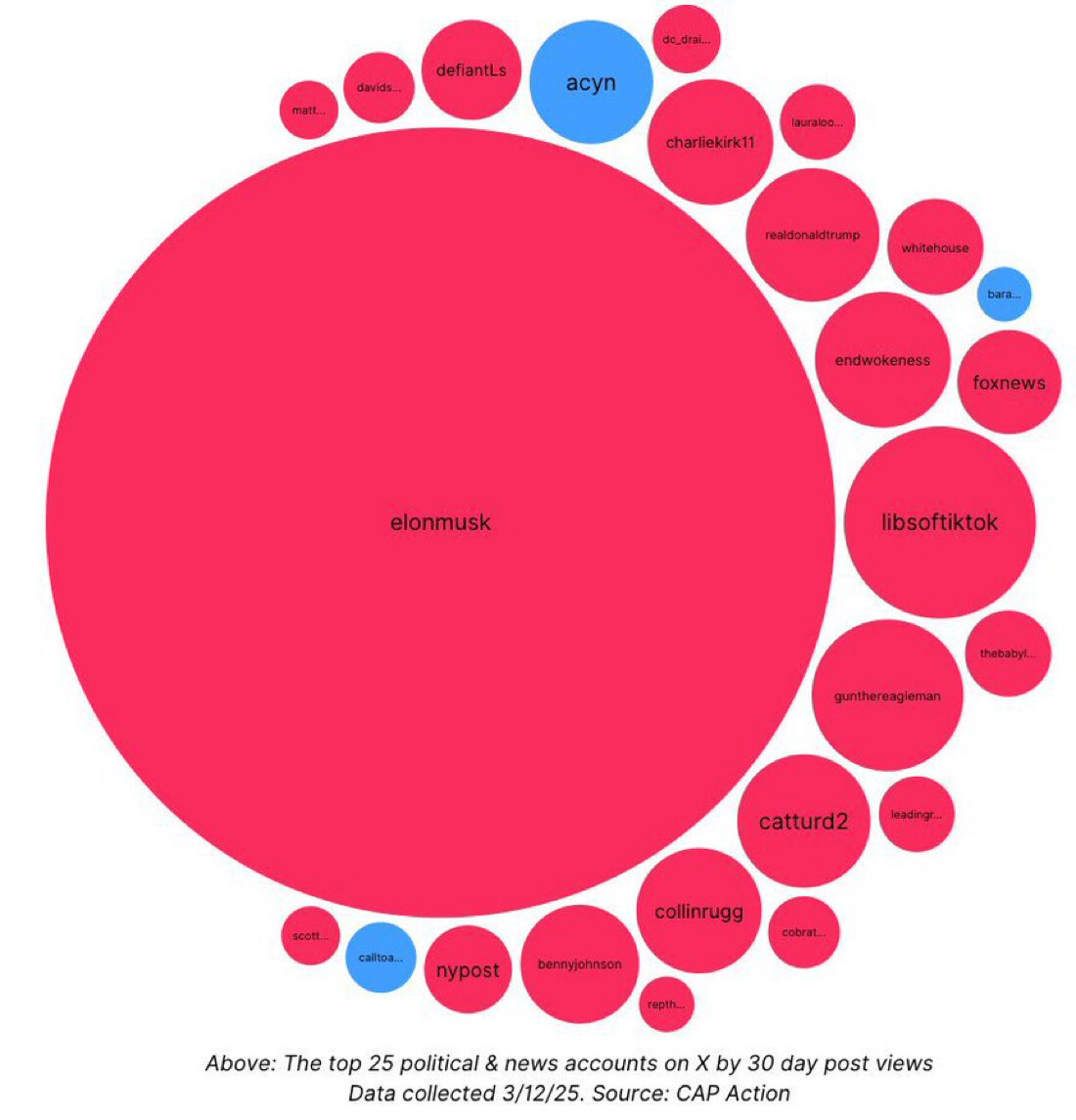
How is a “top” account measured? The obvious answer might be number of followers, but isn’t everyone following Musk by default? Something like total amount of non-bot, non-obligatory influence would be interesting.
But ultimately, who cares, lol. Haven’t signed on to Shxitter in probably 10 years.
Says at the bottom it’s by “30 day post views”
And wow, I knew it was bad, but not this bad. Holy shit.
Still, I wonder about the non-bot, non-obligatory follow version of this beautiful data
I was less wowed by the size of the Elon Musk bubble and more wowed/worried by all but 3 of the other bubbles being red. From the ones I know, I’m assuming red means right wing.
Yeah… not exactly beautiful data presentation here if you have to assume something so basic about a visualization.
Oh yeah, so it does!
What a cesspool.
Isn’t this to be expected when seemingly all lefties have left the platform?
Alternative title: All 25 accounts that still use Twitter
Wow it’s so egregious, this is a good graphic.