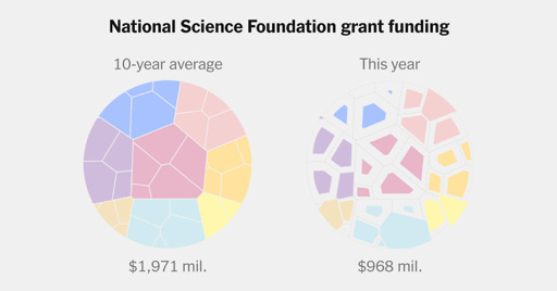
The lag in funding extends far beyond D.E.I. initiatives, affecting almost every area of science: chemistry, computing, engineering, materials and more.
True, the bar chart is probably the best, but both pie and bar outperform, by a wide margin, whatever NYT’s chart is. With this many categories, I feel a pie chart will handle this info better than a bar chart.
From a pure functional perspective, probably. Maybe.
Personally, I look at this more as a piece of art, as the chart was most likely picked because the visuals replicate what its describing: Science funding was shattered and is now in pieces.
Pie charts suck too.
True, the bar chart is probably the best, but both pie and bar outperform, by a wide margin, whatever NYT’s chart is. With this many categories, I feel a pie chart will handle this info better than a bar chart.
From a pure functional perspective, probably. Maybe.
Personally, I look at this more as a piece of art, as the chart was most likely picked because the visuals replicate what its describing: Science funding was shattered and is now in pieces.