
Hi, where else can I upload this image to illustrate what I mean?
This is UI on my nothing phone. I see a major benefit for my everyday mental wellbeing to not have my phone shooting at me with all colors, and instead being “just a good interface”.
There might be some issues with icon recognition and speed of access, but since that’s your device and your icon placement, you eventually getting used to it. In exchange you receive a clean UI which doesn’t overload your receptors, which is a very important thing for the device you look at often.
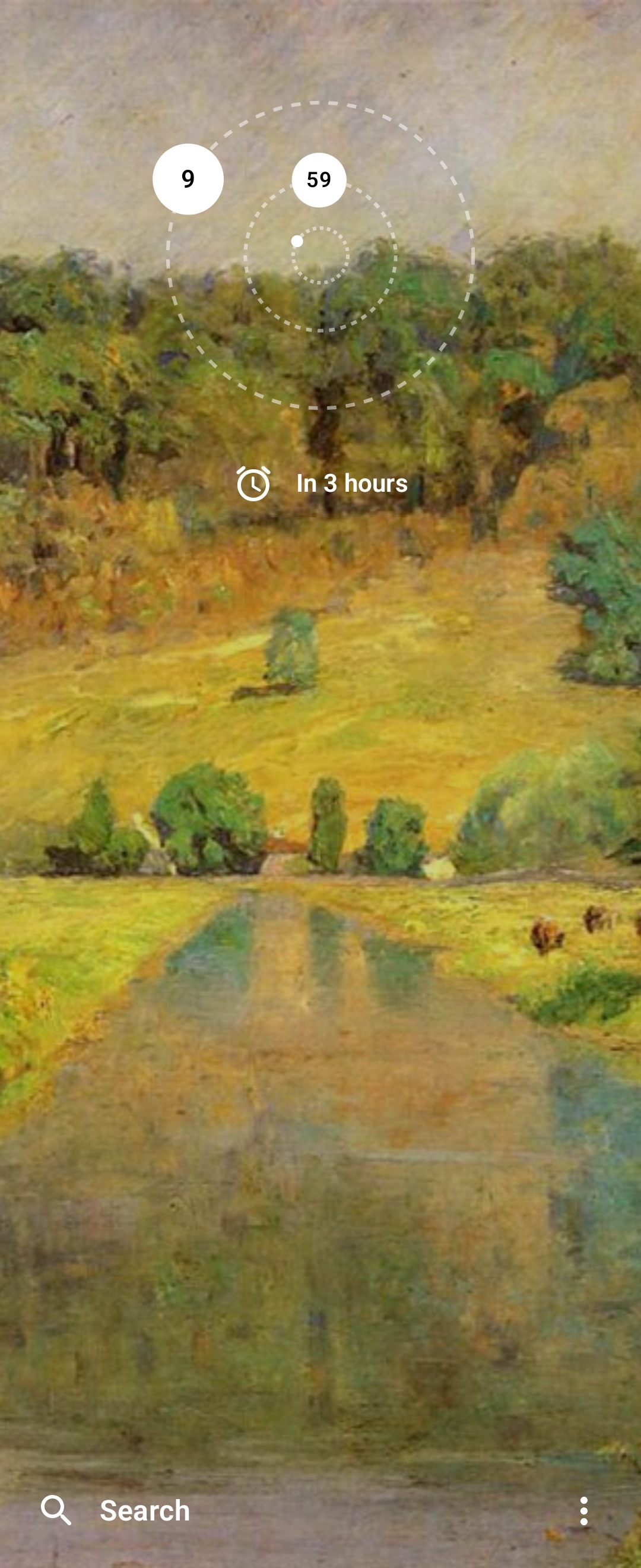
Weather widget in the middle often shows calendar events, but I don’t discolse that for privacy.
Thanks for listening to my TED talk.
Looks like Nothing.
Fine, Dad, take my upvote.
And my Axe!
Let’s have an obscure reference fight!
Good fight, good night!
before the crūtager vikings commit atrocities
Sorry this is the only thing I can think of when looking at those icons

In the same vein, I use Niagara launcher and a monochrome theme - I find it helps with the phone addiction.

Edit: This is just one tool, you also have to really want it to break habits.
Yeah, the same principle. And they UI also done as some custom application you install.
Phone didn’t come with it installed by default, maybe it is now.
While I’ve heard mostly good stuff about Nothing, I noticed an interesting tidbit about early investors on Wikipedia:
raised $7 million from investors including Tony Fadell, Kevin Lin, Steve Huffman, and Casey Neistat.
Steve Huffman of Reddit fame, as a Lemmy denizen I’d say not ideal to be pouring more money in his pockets lol
I only can say… Fuck spez
Nothing to see here, folks…
I do something similar on my phones. The screen turns on to a blank page with just the time and alarm/media playback information.
Home
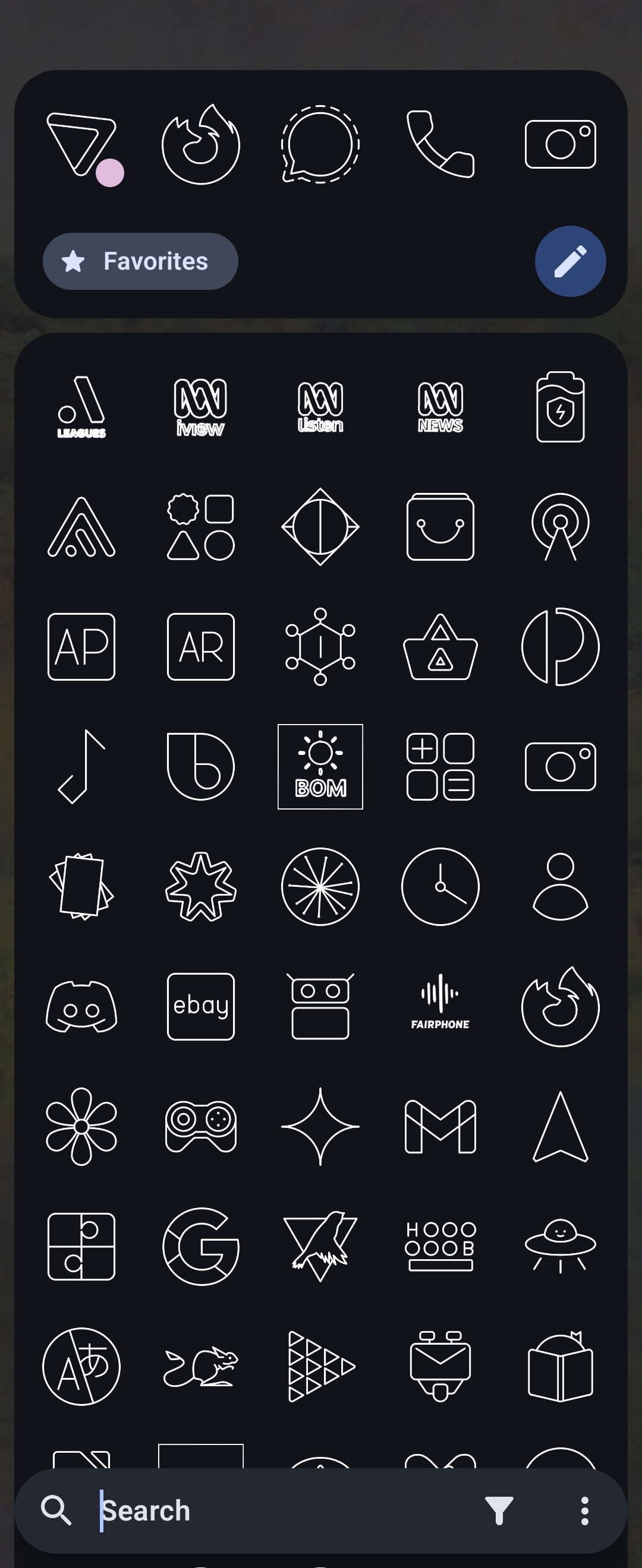
To access my applications I swipe left. I’ve made the icons monochrome and removed their names so I rely on search to find and open the app I want. This makes app launching less of an addictive reflex and more of a conscious decision each time.
App Drawer
Yeah, the same principle.
What’s that Clock widget and what icon pack areyou using here? That’s not Articons is it?
It’s the Orbit clock in the Kvaesitso launcher (one of the stock options). And yes, the icon pack is Arcticons, although I also use Alembicons to create icons for apps that aren’t currently supported by Arcticons.
Ah, no wonder the clock looks familiar. I’ve use Kvaesitso before. Thanks.
I’ve been using T-UI for probably 8+ years now. It hasn’t been updated in ages, but it really doesn’t need to be.
I’ve even built it out by creating a tui folder with empty files in it. Tasker has tasks set to execute when the files are modified, and T-UI has aliases set to touch specific files if commands are entered.
Is there a way to bring back colorful icons without changing the launcher ? The phones and the launcher look solid but these icons make it pretty dull
There’s a setting for it yeah
Yeah, IIRC you can choose between monochrome and colorful options, but it immediately loses that touch and looks like any other Android phone, which is not a bad thing, Android has a good design overall.
You can do the same monochromatic thing with nova launcher and whicons
Awesome! I am glad I have your comment in my history. If I ever change phone to another android, I will come back to it, so I know how to swap to monochrome :3
Look it doesn’t look as good as your UI, but it’s as close as I could get to the monochrome look that I wanted, The widgets still have full colour:

That looks neat, what is the launcher name?
It’s nova launcher, paid, but worth it. Also has the nice side effect that when you move to a different phone tour UI remains the same
Why two clocks and weather-widgets?
Why two clocks and weather-widgets?
Why two clocks and weather-widgets?
Why three comments? 😜
I got a CloudFlare page telling me I was blocked.
3 different data mining parent companies
Middle widget is mostly calendar events, but because my calendar is now free it swapped to weather by its own.
It works well though, because I don’t know where my eyes will land when I start looking at the screen. Sometimes it is the top of the screen, sometimes middle, both will outcomes will tell me about the weather, which is the only reason I look at the screen, honestly.
BankID spotted!
Jo. Proprietary foundation of Swedish society.
looks very clean
Thanks! It is. Maybe their launcher is just available for all Android phones. Or there are other monochrome launchers.
I have one. I hated the stock skin. I like having the apps I use regularly groups together by purpose on my home screen so I can get to them quickly. I immediately re-skinned it.


