I honestly do not mind it one but. I quite like the interface. It’s minimal but there are some bugs to it which is to be expected. I really do like the overall design of it though. There isn’t too much going on. It’s like old Reddit which I am a big fan of
Involve more work but this kind of change is for the best. Freedom from the tyranny of corporate greed!
Is this the part where we seize the means of production and eat the rich? Because I’m here for it.
Nah, we’re just seizing a little corner where the bosses mostly leave us alone.
Okay but if we eat the rich, I’m here for it
Just so we’re clear, we’re definitely eating the rich, right? Don’t just tell me we have the rich at home.
In case anyone was wondering, I’m pro eating the rich btw.
I think having friction to use it can end up as a good thing. Works as a good first filter for bad/low effort users.
I’m still getting used to this and there’s not much activity yet, but I’ll stick with it. Reddit isn’t worth it, so I’m happy there’s a chance for an alternative.
@WallCactus @SpezCanLigmaBalls Give it a good Day. Follow good communities stay on and you will get the hang of it. Just like when you first started using Reddit
Concept is great, but there’s a big usability issue (BE: 0.17.4) that quickly needs fixing. When you browse the main index, new posts just pop up and it messes up whatever you were reading and also closes images.
Liking the clean interface reminiscent of old reddit
username checks out
It’s nice, I just wish there was more activity. Hopefully it will grow overtime. My concern is the barrier of entry for new users. The whole “different instances” thing can be quite confusing.
It’s pretty interesting so far! I’m coming from Reddit Sync and now using Jerboa so it’s quite similar but also a lot of things aren’t where I expect them 😆
I do web dev and UX so definitely agree with the onboarding process being a little clunky for users.
I had no idea what the fediverse was until Lemmy so getting your head around it can be a bit much at the start. I was lucky to find a local server (instance? Not sure on terminology) so no delay issues.
And for any newbies this link is very helpful: https://browse.feddit.de.
I do miss the size of Reddit at times, but that’s likely to drop now anyway with all the buggering around they’re doing.
As a fellow web dev/UX person, I agree completely. It would be neat if there was a FOSS project to create a Lemmy app with all the features that are missing from Jerboa
Jerboa is FOSS? You can make pull requests on the repo here: https://github.com/dessalines/jerboa
I’m starting to think the splintering caused by instances blocking each other is going to cause users to abandon Lemmy entirely. At the moment instances can suddenly decide to block other instances, and that is going to hurt both users on the instance that put a block into place, as well as users on the blocked instance.
The blocking is awful for an average Lemmy user, because you can get cut off from communities you already subscribed to, without any notification! So you might post and comment without realizing that your content is not getting published, even though you and your local instance still see it.
The user experience would be improved by getting a warning if you try to contribute to a community in this case. And also your subscriptions should show warnings about not working anymore, and those should come up as notifications on the account.
All I’m missing right now is sorting (comments at least) by new, top or best etc
That feature exists, unless you’re posting from mastodon or some other platform?
It doesn’t appear to exist in Jerboa, the Android client
I don’t know about 3rd-party tools, but the default web client has it: Hot/Top/New/Old
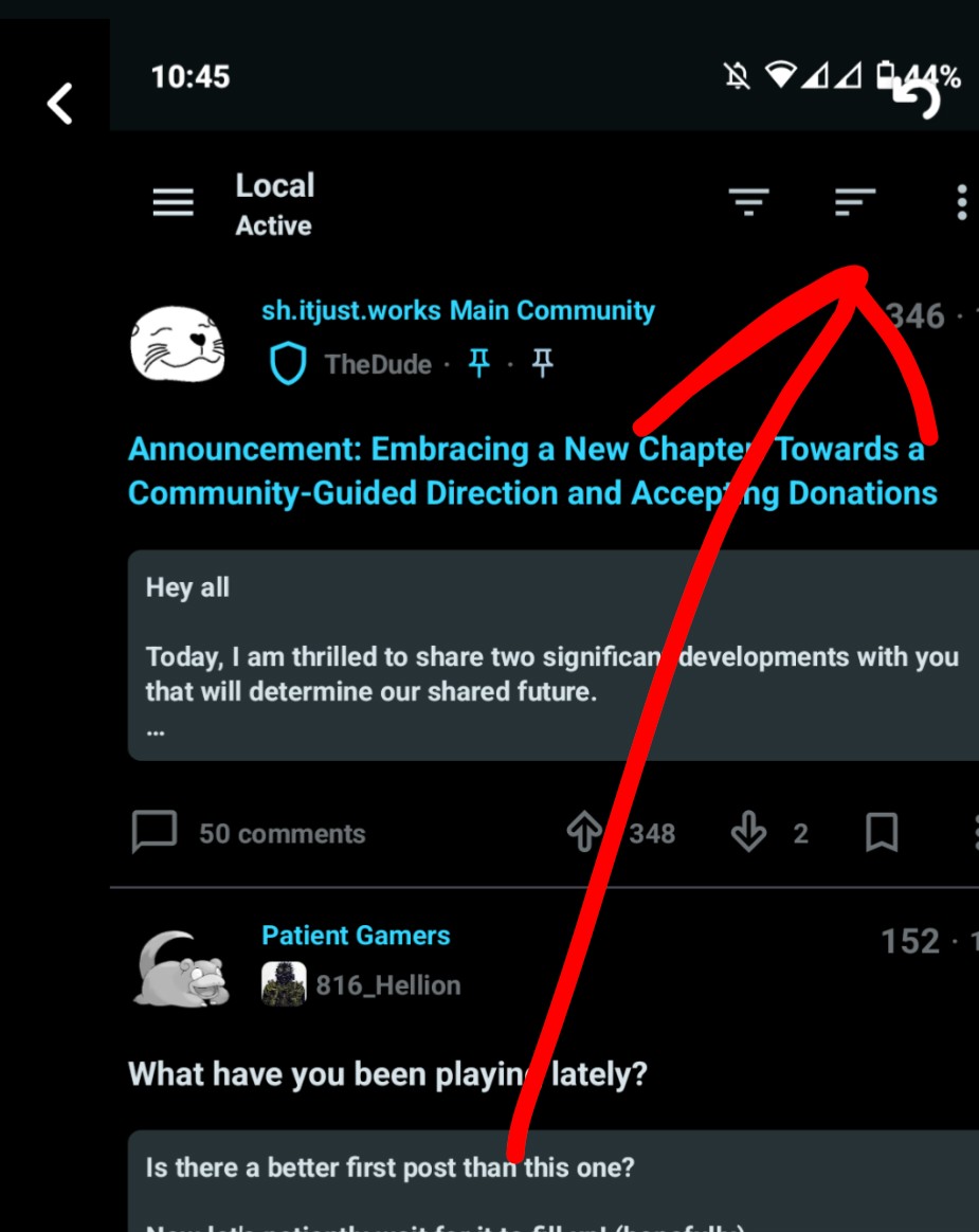
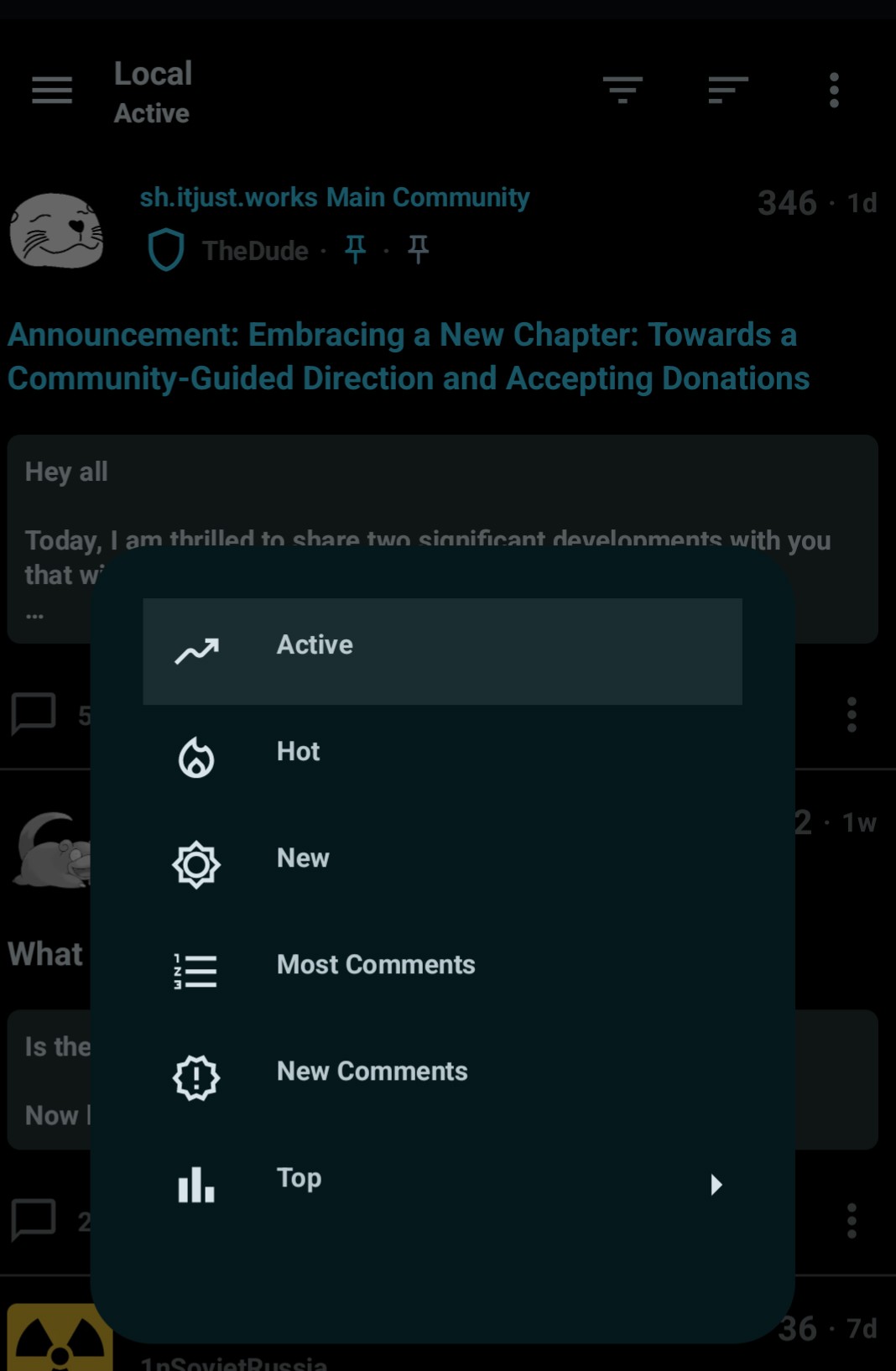
Did you find it? It’s in the upper right hand corner. Not sure if it’s a new addition since you posted this.
Still not there
How to open options

Options

That sorts posts, not comments, which is what the previous commenter was asking about.
I like it. I prefer the UI plus it’s really refreshing to browse some similar communities i also browse on reddit and not seeing that many memes.
The more I understand it, the more I love the concept of it. What really illuminated the concept of the fediverse for me was an illustrated diagram I saw on Lemmy earlier, which made the analogy of being able to email a gmail address even if you have hotmail.
Did you maybe save it? I’d like to see it!
I feel like such a noob but I didn’t save it and I can’t even remember if it was on Mastadon or Lemmy since it’s all so new, so I’m looking for it, but in the meantime here is this, which is also pretty helpful: https://lemm.ee/comment/63579
Once you get a hang of how the fediverse works in general, it’s pretty good so far. Using mostly mobile atm, nice and clean, functional pretty similar experience to reddit. Aside from a few features missing like search, I’d imagine there is plenty of room for moderator tools too, and the occasional error codes, I’m loving it so far. No ads, just content, and while it’s not the firehose that reddit is/was, if this keeps getting popular, I could forsee just as many communities popping up across instances as there are subreddits.
I’m sure with the influx of users from reddit, especially the more technically savvy mods we’re going to see a lot of good tools made for the app and with it being open source, I imagine the devtimes are going to be even quicker than dealing with an ok API.
I am very excited to see what kinds of moderator tools pop up, for sure. I love this a bit more than I thought I would even though yes, getting started does feel pretty wobbly. lol
Overall, I’m liking it, but I have some critiques:
- The apps won’t follow hyperlinks to third-party servers. This is not Lemmy’s fault; the Universal Links feature of Apple OSes and App Links feature of Android were not made with federation in mind. This will be a tricky problem for them to solve without getting seriously technical.
- I don’t like how external links don’t open in new windows/tabs by default, and there appears to be no preference to fix this.
- There appears to be some bugginess with the web interface and voting where, if I upvote something, the upvote may disappear a second or two later. But if I refresh and re-read the comment, my original upvote stuck.
- There needs to be more centralization of subs; as of now, there is so much duplication that it’s worse than Reddit. Reddit has some forked subs, mainly on ideological grounds or because of mergers, but it’s got nothing on Lemmy so far.
- When reading on the web, my view jumps around a lot. I’m guessing it’s loading in new comments as they come in on the server. That’s fine, but the abruptness of the whole thing causes me to sometimes lose my place. If it’s going to continuously load new comments, I would prefer that they be animated, so at least I can observe the change in motion.
- While I was typing this, I noticed that the page top reloaded with a different topic. I’m guessing that’s a bug.
- It’s good to have rules to prevent conversations from descending into chaos. I just hope that the rules are not interpreted too broadly.
For point 1, does this help? https://feddit.uk/post/9352
No, because I’m talking about Universal Links/App Links, the feature of Android and iOS/macOS where you tap/click on an HTTP(S) link to some site, and the link opens & gets handled in the app. The feature was made with centralization in mind, so it won’t work with federated servers, especially for users on small servers.
So what I think you’re talking about is called deep links, and it’s certainly a challenge in this scenario
I’m pretty sure it’s solvable with some effort, I’m working on a Lemmy client now and will look into intents that could be sent from the Lemmy front end. My main concern is just recognizing the links in-app robustly as people learn how to format them - if the client doesn’t kick you into the browser, it solves half the problem and I’ll worry about the other half
4- You signed up for a decentralized service that advertises the lack of a central authority, to leave a central authority, and now you’re complaining there’s no central authority.
This isn’t Reddit, and it’s not designed to be a Reddit clone. There are people working on 1 for 1 clones, and it’s totally fine if you want that, but maybe you should find one of those instead of demanding the people who built a specific platform with a specific vision immediately ditch all of that to cater to Reddit exiles.
I didn’t demand anything; I just made a criticism. There’s a difference.
I’m fine with there being no central authority for servers; I just wish there was a central authority for subs, like there is with Usenet, which has no central authority for servers, but it has a central authority for groups carried by the servers. Without one, the user base gets fragmented pretty quickly.
Without one, the user base gets fragmented pretty quickly.
A- I’ve seen a few community browsers pop up, you can find one in most intro threads and there’s also a built in explorer.
I really like lemmy so far. With such a small community it almost feels like how online forums used to be
Yes! It sorta reminds me of the early days of Reddit ironically. It has a nostalgic charm to it.
I’ve been on Reddit for 17 years. Definitely reminds me of when it was a much smaller community.
Was just saying this to my friend. Big difference is it is auto darkmode and not white like reddit was.
i like that it [at least in the foreseeable future] won’t debut some vomit-ass new design whose only purpose is to make number go up
Default dark mode is the sign of a good platform.
It feels very raw and less curated which I like. It feels more like I’m interacting with people and less like I’m interacting with an algorithm
Or what some mod thinks you should and should not be seeing.
Signed up today, liking it a lot. Looking forward to learning more about it, seems like a viable reddit alternative.


